
With mobile users making up a significant portion of web traffic, ensuring your website functions flawlessly on all devices is crucial. Poor mobile performance can lead to frustrated users, higher bounce rates, and lower search rankings. This is where mobile website testing comes in, it ensures your site is responsive, user-friendly, and optimized for different screen sizes, operating systems, and network conditions. In this blog, we will learn what mobile website testing is, why it’s important, how to conduct it effectively, and the best practices to follow. Read along to find out.
What Is Mobile Website Testing?
 Mobile website testing refers to the process of evaluating a website’s performance, usability, and compatibility across various mobile devices and browsers. It ensures that your website is responsive, user-friendly, and fully functional, no matter what device your visitors are using.
Through this testing, you check how well your website adapts to different screen sizes, operating systems, and browsers, ensuring a smooth experience for users on smartphones, tablets, or other mobile devices.
Why Is Mobile Website Testing Important?
Mobile website testing is essential for you as a business owner or developer for several key reasons:
- Mobile-First Indexing: Google now prioritizes mobile-friendly websites in search rankings. By ensuring your website is optimized for mobile, you increase your chances of ranking higher in search results, bringing in more organic traffic and visibility.
- User Experience: A well-optimized mobile site makes for a better user experience, leading to increased engagement, longer visits, and fewer bounce rates. The smoother the experience, the more likely users are to return.
- Performance & Speed: Mobile users expect fast load times, and slow websites can result in frustration and abandonment. By optimizing performance, such as reducing load time, you can keep users on your site longer, improving retention and conversion rates.
- Cross-Device Compatibility: Testing ensures that your website works seamlessly across different screen sizes, operating systems, and browsers. This consistency across devices is key for providing a reliable and positive experience, no matter how your visitors access your site.
How To Perform Mobile Website Testing
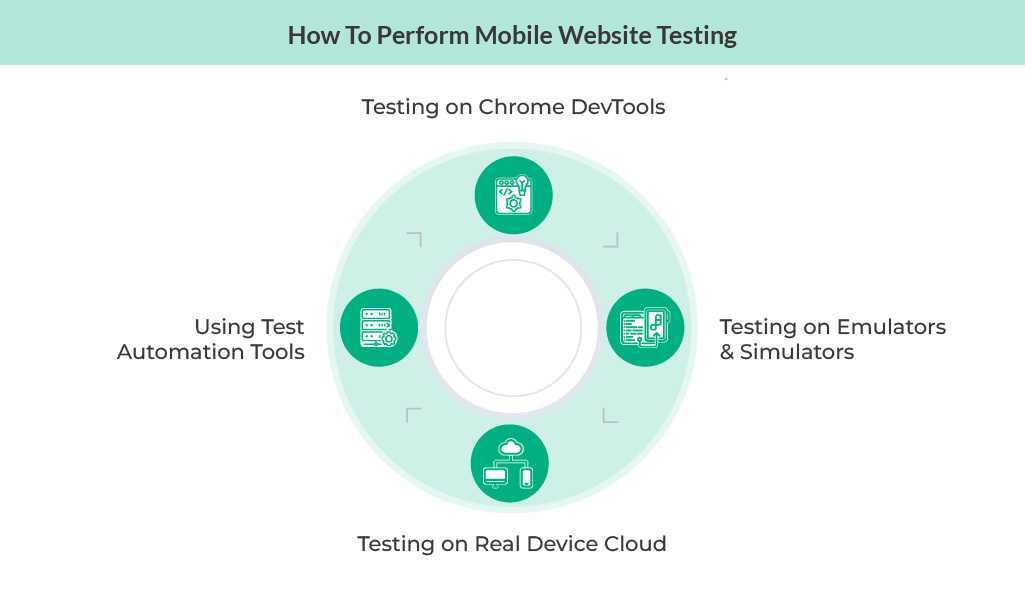
Now, let’s explore different methods you can use to effectively test a mobile website and ensure its optimal performance.
Method 1: Testing on Chrome DevTools
Chrome DevTools allows you to simulate mobile devices directly from your desktop browser. With this tool, you can inspect elements, debug performance issues, and test various screen resolutions quickly.
It’s a great way to get a general sense of how your website will perform on mobile. However, while this method is useful for initial testing, it doesn’t replace testing on actual devices, as it may not replicate certain behaviors or hardware interactions.
Method 2: Testing on Emulators & Simulators
Emulators and simulators help you test mobile behavior without needing physical devices. They allow you to check how your website performs across different operating systems and screen sizes.
These tools can be handy for testing a wide range of scenarios quickly, but they may not fully capture real-world conditions, such as variations in network speed or user interactions like touch gestures, making them less accurate than testing on real devices.
Method 3: Testing on Real Device Cloud
Cloud-based platforms like Sauce Labs allow you to test websites on real devices remotely. This method provides highly accurate results, simulating real-world conditions, including network fluctuations and hardware differences.
Using a real device cloud ensures your website performs as expected across a variety of devices and browsers, offering a more authentic testing experience.
Method 4: Using Test Automation Tools
Test automation tools like Selenium, Appium, or Cypress can speed up the testing process significantly. Automated testing ensures consistency, reduces human error, and allows you to cover a wide range of test scenarios efficiently.
This method is especially useful for regression testing and large-scale projects that require frequent updates, as it helps you run tests faster and with greater accuracy.
How to build a Mobile Website Testing Strategy?
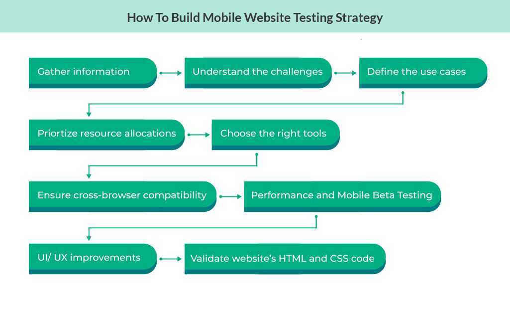
To build an effective Mobile Website Testing Strategy, it is essential to follow a comprehensive and structured approach. The goal is to ensure that your mobile website performs optimally across a variety of devices, browsers, and network conditions. Here’s how to build a well-rounded mobile website testing strategy:
Information Gathering
The first step in building a mobile website testing strategy is gathering information. This is a crucial phase where we need to understand the audience, the devices they use, and the browsers they prefer.
By identifying the most common devices and browsers among our target audience, we can tailor our testing efforts effectively. Additionally, understanding user behaviors, such as frequent actions on the site and common pain points, helps prioritize the testing of features and interactions most relevant to them.
Understand the Challenges
Mobile website testing comes with unique challenges, and it’s important to recognize these early on. These include device fragmentation, where different devices (smartphones, tablets, etc.) have different screen sizes, resolutions, and hardware capabilities.
There are also network variability challenges, as mobile networks can fluctuate from 3G to 5G or Wi-Fi. Additionally, browser differences might lead to issues with rendering or functionality across platforms. We need to ensure that our test cases address these challenges comprehensively, considering every possible device, connection type, and browser.
Defining the Use Case
At this stage, it’s critical to define the key use cases of your website and identify the main functionalities that need to be tested. We will focus on aspects like navigation, responsiveness, and interactive components (forms, buttons, etc.) to ensure the website performs as expected on mobile.
Understanding what features users engage with the most will help us target our testing efforts more effectively and cover essential functionality.
Prioritizations
Once we have a clear idea of the use cases, we’ll move on to prioritization. Using analytics data, we can identify which devices and browsers are most commonly used by our target audience. We then focus our testing efforts on these devices and browsers first, as they have the highest usage.
This ensures that we allocate resources efficiently, testing the most important combinations of device/browser to maximize coverage without unnecessary testing efforts on less relevant configurations.
Deciding on the Tools
The right tools can make or break a mobile website testing strategy. We need to carefully select the combination of manual and automated testing tools based on our requirements. Tools like DevTools (such as Chrome DevTools) allow for quick testing and debugging in real-time.
Testing on real devices ensures accurate results across a variety of platforms, and automation frameworks help speed up repetitive testing tasks. Using the right tools will help ensure comprehensive coverage, accurate results, and efficiency.
Ensuring Cross-Browser Compatibility
Cross-browser testing is essential to ensure that your website works properly on all major browsers. We need to test across browsers like Chrome, Safari, Firefox, and Edge, ensuring that rendering, layout, and functionality remain consistent across these platforms.
Identifying specific issues in rendering or functionality for certain browsers and fixing them will help ensure users across different browsers have a seamless experience.
Performance Testing
Mobile performance is crucial for user experience and retention. During performance testing, we need to evaluate how the website performs under varying network conditions like 3G, 4G, and Wi-Fi. This includes testing how fast pages load and how the site performs under heavy usage or low network bandwidth.
Optimizing elements like images, caching, and code is key to improving page load speeds and overall performance, especially on mobile devices with limited resources.
Performance Analyzers
To help assess the website’s performance, you can use tools such as Google Lighthouse or WebPageTest. These tools provide in-depth reports on page load times, performance bottlenecks, and suggestions for improvement. By utilizing such performance analyzers, you can ensure that the website is fully optimized, delivering an excellent user experience on mobile devices.
Mobile Beta Testing
After the initial rounds of testing, it’s time to engage real users in beta testing. Beta testing helps us gather valuable feedback from actual users on usability and overall user experience. This step allows us to identify pain points that may not have been detected during earlier testing phases.
It provides an opportunity for real-world feedback and gives us a chance to fix any issues before the official release, ensuring that the website is truly optimized for its audience.
UI and UX Improvements
A well-designed UI (user interface) and UX (user experience) are fundamental for mobile websites. We’ll ensure the design is mobile-friendly, with intuitive navigation and touch-friendly elements.
Testing user interactions like scrolling, swiping, and tapping ensures that the mobile website provides a smooth and engaging experience. This phase focuses on improving the usability and design aspects to make sure the mobile website is not only functional but also enjoyable to use.
Validate the HTML and CSS Code
We need to validate the website’s HTML and CSS code. Using validation tools, we’ll check for any coding errors or discrepancies that could affect the mobile rendering of the site. Ensuring that the code is clean and follows best practices for responsive design is essential for ensuring the website performs well on a variety of mobile devices.
Properly optimized and validated code reduces the likelihood of rendering issues and makes the mobile website more stable.
Conduct Security Testing
In addition to performance and design optimization, it’s also crucial to perform Security Testing to identify vulnerabilities that could put the website at risk. This includes checking for common security threats like SQL injections, cross-site scripting (XSS), and other potential breaches. By regularly testing for security issues, we ensure that sensitive data is protected and the website remains safe for users to interact with. Vulnerability assessments and timely patches to security flaws help mitigate the risks associated with cyber threats.
Challenges of Mobile Website Testing
Let us now discuss common challenges testers face and how to overcome them:
- Device Fragmentation: Testing across multiple devices can be time-consuming and resource-intensive. With a wide variety of screen sizes, operating systems, and hardware, it’s difficult to cover all possible combinations. To overcome this, prioritize testing on the most popular devices based on analytics data and target specific user segments.
- Network Variability: Mobile performance can vary significantly depending on network speed and signal strength. Websites that perform well on Wi-Fi might experience slow load times on 3G or unstable connections. Overcoming this challenge requires testing under different network conditions to ensure performance is acceptable across varying speeds.
- Frequent OS & Browser Updates: Mobile operating systems and browsers are updated regularly, often introducing new features or changes that could impact compatibility. To stay ahead, it’s crucial to continuously test your website after every update to ensure it remains functional across the latest versions of mobile OS and browsers.
- Touchscreen & UI Issues: Mobile users interact with their devices differently than desktop users. Features like touch gestures, swipe actions, and screen rotations can affect the user experience. To address this, usability testing on mobile devices is critical to ensure intuitive navigation and smooth interaction.
Best Practices for Conducting Mobile Website Testing
To achieve successful mobile testing, follow these best practices:
- Use a Mix of Manual and Automated Testing for Comprehensive Coverage: Combining manual testing for user experience insights and automated testing for efficiency helps you cover both functionality and usability effectively. Automated tests can quickly handle repetitive tasks, while manual tests can capture user-specific behavior.
- Test on Real Devices Whenever Possible to Get Accurate Results: Emulators and simulators are useful, but testing on actual devices ensures more reliable results. Real-device testing helps capture performance issues, touch interaction problems, and other nuances that emulators might miss.
- Regularly Update Test Cases to Align with New Mobile Trends and User Expectations: The mobile landscape evolves rapidly, so it’s essential to keep your test cases updated. Regularly review new mobile trends, user behaviors, and technological advancements to ensure your tests reflect the current user experience.
- Optimize Website Speed and Responsiveness for a Better User Experience: Mobile users expect quick loading times and seamless responsiveness. Test and optimize your website’s performance by reducing image sizes, optimizing scripts, and leveraging caching techniques. Fast load times improve user retention and satisfaction.
- Ensure Accessibility Compliance to Make the Website User-Friendly for All Audiences: Accessibility is key to ensuring that your website is usable by people with disabilities. Test for compliance with accessibility standards (e.g., WCAG) and implement features like voice navigation, screen reader compatibility, and proper color contrast to create an inclusive mobile experience.
Conclusion
Mobile website testing is essential for delivering a seamless and engaging user experience. You can ensure your website performs optimally across all mobile devices by leveraging the right tools and strategies. Implementing thorough testing methodologies reduces performance issues, enhances user satisfaction, and improves search engine rankings.
QA Touch is an effective test management platform that can streamline your mobile website testing process quite easily. From in-built bug tracking to timesheets, audit logs, seamless dashboard and more, we can help you make the most out of your testing requirements.
Sign up today to enhance your testing strategy.


